Style
How to Style Bold Prints Without Overdoing It
Jun
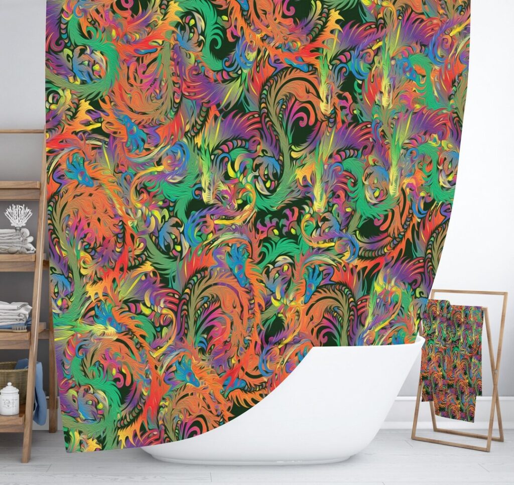
Bold prints have an undeniable allure. Whether it’s a vibrant geometric rug, an intricate paisley throw blanket, or curtains adorned with striking florals, these eye-catching designs can instantly transform any space from ordinary to extraordinary. Yet many homeowners hesitate to embrace bold patterns, worried about creating rooms that feel chaotic, overwhelming, or simply “too much.”
The secret to successfully incorporating bold prints lies not in avoiding them, but in understanding how to balance their visual weight with thoughtful design choices. When done right, a single statement piece can become the perfect focal point that adds personality and energy to your space without dominating it.
Understanding the Impact of Bold Prints
Bold patterns naturally command attention. They create visual interest, add depth to flat surfaces, and can make spaces feel more dynamic and alive. However, their inherent power means they require careful consideration in placement and pairing.
Psychologically, busy patterns can stimulate the mind and energize a space, but too many competing elements can create visual fatigue. The key is harnessing this energy in a controlled way that enhances rather than overwhelms your living environment. Think of bold prints as the exclamation point in your room’s design sentence – powerful when used purposefully, but jarring when overused.
The Foundation: Start with Neutrals
The most successful bold print styling begins with a neutral foundation. Colors like crisp whites, warm creams, soft grays, and gentle beiges create the perfect backdrop that allows your statement pieces to truly shine. These calming base tones provide visual rest areas that prevent your space from feeling chaotic.
When selecting your neutral palette, consider the undertones in your bold print. A rug with warm-toned patterns pairs beautifully with cream and beige walls, while cool-toned geometric designs complement gray and white schemes. This thoughtful coordination ensures your bold piece feels intentional rather than accidentally placed.
Neutral doesn’t mean boring. Varying textures in your base elements – like a nubby white throw pillow against smooth gray walls, or natural wood furniture against painted surfaces – adds depth while maintaining the calm foundation your bold print needs to make its statement.
The One-Statement-Piece Rule
The most foolproof approach to styling bold prints is the one-statement-piece rule. Choose a single item to carry the room’s pattern load, whether that’s a show-stopping area rug, dramatic curtains, or a beautifully patterned throw blanket draped over your sofa.
When deciding which piece should be your statement maker, consider your room’s architecture and natural flow. In spaces with large windows, bold curtains can frame the view beautifully while adding drama. In seating areas, a patterned rug helps define the conversation zone. For bedrooms, a bold throw blanket at the foot of the bed adds visual interest without overwhelming the restful atmosphere.
The size of your space also matters. Larger rooms can handle bigger, more dramatic patterns, while smaller spaces benefit from medium-scale prints that add interest without making the area feel cramped.
Balancing Act: Mixing Prints with Solids
Once you’ve chosen your statement piece, the rest of your textiles should primarily be solid colors that complement and support your bold print. A good rule of thumb is the 80/20 ratio – 80% solids to 20% patterns for a balanced look that feels curated rather than cluttered.
Pull accent colors directly from your bold print to create cohesion throughout the space. If your statement rug features navy blue and coral accents, incorporate these colors in solid throw pillows, artwork, or small decorative objects. This technique ties your room together while allowing your print to remain the star.
When you do want to introduce additional patterns, keep them subtle and in a different scale. A large geometric print pairs well with small-scale textures like subtle stripes or tiny dots, but avoid competing patterns of similar size and visual weight.
Strategic Placement and Proportion
Successful bold print styling requires understanding proportion and visual weight. In smaller rooms, choose prints with more open space between pattern elements – these “breathing room” designs prevent the space from feeling cramped. Larger rooms can handle denser, more complex patterns that might overwhelm a cozy space.
Consider the natural focal points in your room. Bold prints work beautifully when they enhance existing architectural features rather than compete with them. A patterned rug can highlight a beautiful coffee table, while bold curtains can emphasize tall windows or high ceilings.
Pay attention to sightlines as well. Your bold print should be visible from the room’s main entry point, but positioned so it draws the eye in rather than overwhelming visitors as they enter the space.
Complementary Elements That Enhance Bold Prints
The right supporting elements can make your bold print sing. Natural textures like jute, rattan, and unfinished wood provide organic contrast to busy patterns, while metals in warm brass or cool chrome add sophisticated shine without competing for attention.
Lighting plays a crucial role too. Ensure your statement piece is well-lit but avoid placing it in harsh direct light that might make the pattern feel aggressive. Soft, layered lighting helps integrate bold prints into your overall ambiance.
Plants are excellent companions for bold prints. Their organic shapes and natural green tones provide a fresh counterpoint to geometric patterns and help soften any visual intensity. Choose planters in neutral tones that complement your color scheme.
Common Mistakes to Avoid
The most frequent styling mistake is using multiple bold prints without enough neutral space between them. This creates visual competition and makes rooms feel unsettled. Always provide plenty of solid-colored breathing room around your statement pieces.
Another common error is choosing prints that are too large for the space. Oversized patterns can make small rooms feel even smaller and create an overwhelming effect. When in doubt, go slightly smaller rather than larger with your print scale.
Don’t forget about negative space – the empty, undecorated areas that give your eyes a place to rest. Bold prints need these visual pauses to be truly effective. Resist the urge to fill every surface with pattern or decoration.
Room-by-Room Applications
Living Rooms: A bold rug works beautifully as an anchor piece, defining your seating area while providing comfort underfoot. Keep furniture and walls neutral, then pull accent colors from the rug into small accessories and artwork.
Bedrooms: Bold throw blankets or accent pillows add personality without overwhelming the restful atmosphere. Position them at the foot of the bed or in a reading chair where they provide visual interest without competing with sleep.
Dining Rooms: Statement curtains can transform eating spaces into dramatic settings for entertaining. The vertical lines of bold drapery panels can also make rooms feel taller and more elegant.
Home Offices: A patterned rug under your desk area can help define the workspace while adding energy that supports productivity. Choose patterns with colors that make you feel focused and inspired.
Creating Your Balanced Space
Successfully styling bold prints is about confidence, patience, and restraint. Start with one statement piece you truly love, build a neutral foundation around it, and add complementary elements gradually. Trust your instincts – if something feels “off,” it probably is, and simple adjustments can usually restore balance.
Remember that your home should reflect your personality while providing comfort and peace. Bold prints can absolutely be part of a serene, well-designed space when they’re thoughtfully integrated rather than randomly scattered. Take time to live with your choices, and don’t be afraid to make adjustments as you discover what works best for your lifestyle and aesthetic preferences.
The goal isn’t to play it safe, but to be intentional. With these principles as your guide, you can confidently embrace the transformative power of bold prints while creating spaces that feel both exciting and harmonious. Your home should tell your story – let bold prints be one beautiful chapter in that narrative.